In the past, it might have been true, but what’s above the page fold is no longer the one and only thing that propels your prospects to make a purchase. What increases sales, on the other hand, is good content and the ability for users to engage with your page.
Above the Fold
The “above the page fold” is the part of a website visible on the screen without the user having to scroll down. Many digital marketers still believe that CTAs only within that visible part convert best.
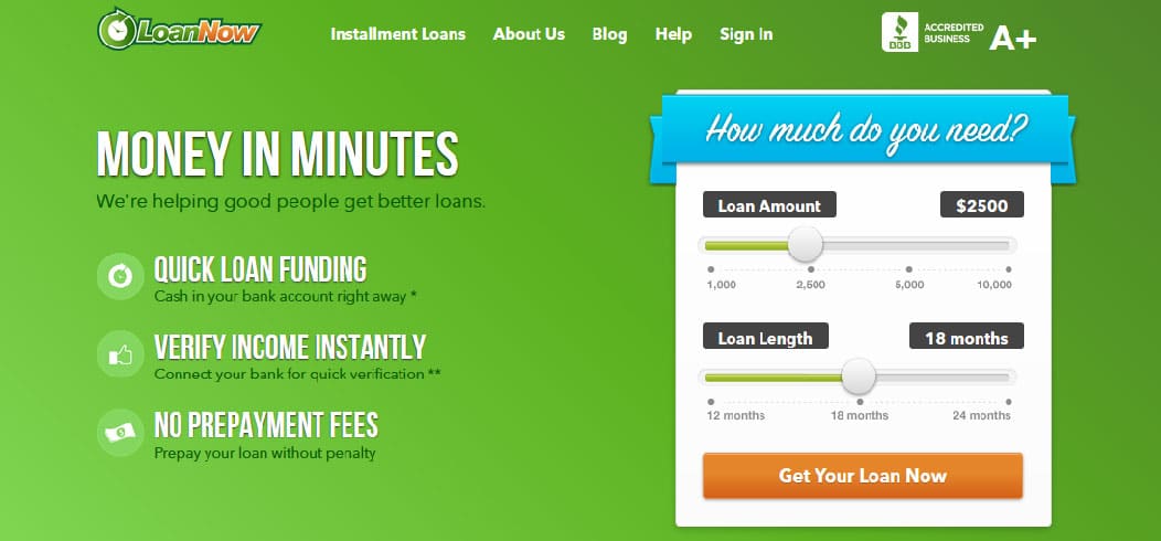
This statement is valid for simple landing pages, like this one:

Source: LoanNow
But the more sophisticated and comprehensive your product or service is, the less information you’re able to squeeze into that relatively small space above the page fold. And even if you do squeeze it in there, it will confuse readers:

Source: unbounce
There’s also another problem with this type of landing pages. They look generic, and generic pages rarely spark interest if there’s no content attractive to prospects. And no, two sentences or a bullet list still won’t do it, because without first explaining what it is that your offering, how can you expect to sell anything?
Scrolling for more
People want information. But not just any information. They want quality information that will help them solve their problems. Redirecting them to a landing page with only a sign-up form without any additional information isn’t going to solve their problems – even if the product has this potential, because how can they know it has?
Intrigue and entertain above the fold. Make them scroll down for more, and then make them sign up.
Increased user experience
Aside from marketing purposes, longer pages also simplify browsing and absorbing information: “For a continuous and lengthy content, like an article or a tutorial, scrolling provides even better usability than slicing up the text to several separate screens or pages.” – UXMyths.
Consider you ranking
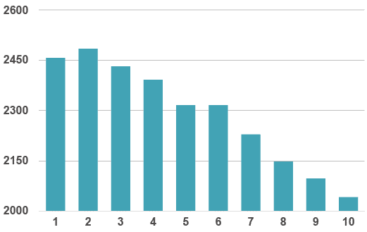
But it’s not only about scrolling. Websites with longer content rank better in search results:
Avg. Content Length of Top 10 Results

Source: Neil Patel
So if you have valuable and engaging content on your site, don’t be afraid your users won’t scroll down to see it. In fact, they are very likely to scroll right down to the bottom of your page. Analysis of TMZ.com site revealed that link at the bottom of the TMZ’s homepage is the one most frequently used – and that link leads to more content.
To analyze the extent of your prospects’ scrolls, use plugins such as Scroll Depth, for example.
Summary
By combining valuable, in-depth content with high website usability, you’re significantly increasing user experience and conversion rates. So grab your users’ interest at the top of your page, and take them on a journey below the fold.

