Smooth navigation is one of the crucial elements that make or break a successful website. If after landing on your website visitors are welcomed by the lack of clarity and misleading links, they will most likely flee to competition. Ensuring that users know where they are on a web page makes them more inclined to browse the content within it.
Below are the goals your site should meet to provide visitors with pleasant browsing experience, thus increasing your conversion rates.
1 Main sections of the website – visible and easy to find
Use standard navigation templates. Visitors will focus on the content of your website when they are familiar with the navigation scheme. Don’t make them think twice about their moves within your website; instead, make them think about what your site has to offer.
2 Inform your users where they are, at all times
Implement coherent menu structures and navigation spots throughout the site so that the user can browse the site further intuitively, without wondering where links to every thing are. Also, in case they get lost, provide your visitors with an option of going back to the content they came to the site for in the first place.
3 Show only relevant and related navigation menus
Your navigation menu should be unified and in context to the entire site. Again, don’t confuse your readers with something that’s unrelated.
4 Visible search bar and suggested reading sidebar
If you have a lot of content on your website, allow your visitors to explore it to the full est by making it easier for them to find what they need. Whether it’s a particular phrase they are interested in – have a search bar always at the ready; whether it’s a series of related articles – let the readers know it via a handy sidebar with suggested readings.
Now, let’s take a look at different types of menus:
Fixed Menu
A fixed menu will help users understand where they are even if they are engrossed in the content; it will also give them an easy access to the key sections of your site. A fixed menu has to be clear and readable; it absolutely cannot be crowded or eye-catching. A unique CTA should be highlighted in the menu and in coherence with the site’s main goal.
Remember, keep main sections of the menu visible and accessible to the visitors 100% of the time.
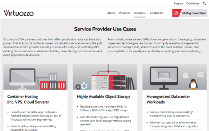 Source: Virtuozzo
Footer Menu
Footer menu is basically a repeated (or expanded) main menu. The links in the footer menu will encourage users to continue browsing the website once they have reached the end of the page they were reading. It is also a good place to put CTA and source of basic company contact information such as email, address, and phone number.
 Source: Virtuozzo
Breadcrumbs
- Sub-navigation and pathfinderBreadcrumbs greatly improve usability and navigation. They are usually found below the header on a website with many categories and pages. They help the user orient his or herself within a page.Here’s what they look like: home page –> section page –> sub-section pageBreadcrumbs should not be confused with primary navigation menu – breadcrumb trail is just a way of letting the user understand the site ‘s structure and browse parent pages/categories. Breadcrumbs are unique and serve to map the structure of the site.
- Where to place the breadcrumbs?Header in its traditional way is a piece of content that is usually related to the page but has no specific content. It could be just a category or even a showcase slider. In that case, breadcrumbs usually go after the header.
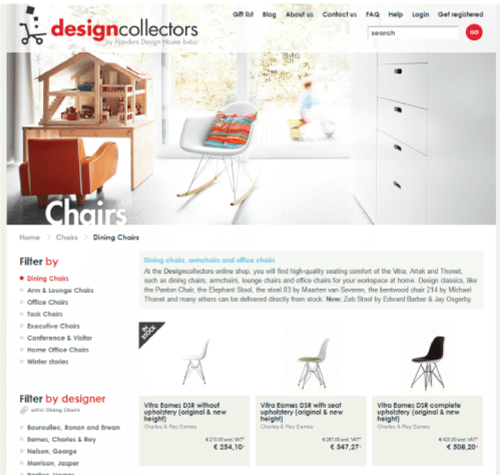 Source: designcollectors
On the other hand, breadcrumbs are not always attached to the idea of a header. In fact, they usually go just at the very start of the page content as a sub-navigation help.
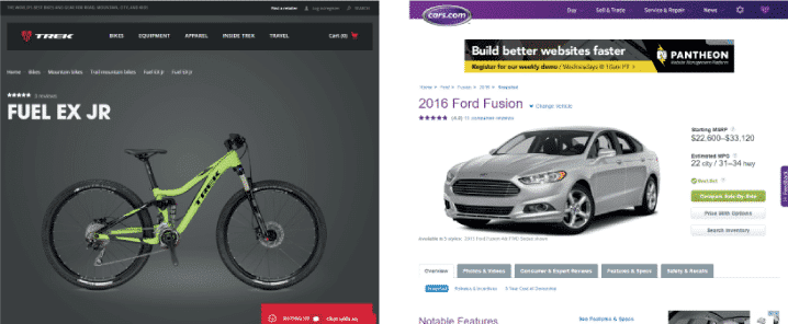
However, if you place specific data in the headers of your pages/posts such as title, then the header becomes part of the page content. Therefore, the breadcrumb should be the first thing in the content. In fact, inserting breadcrumbs just before titles makes a lot of sense. It is then the first element in the content.
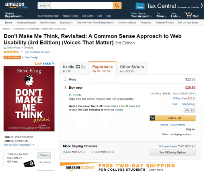 Source: Amazon
Drop Down Menu
Shows pages belonging to various categories in main menu. Drop down menus make the navigation even easier for the viewers.
 Source: Virtuozzo
Navigation Sidebar
Typically on the left side, navigation sidebar shows all the site’s navigation structure. Just like the drop down menu, it helps viewers orient themselves within the structure of the website.
 Source: Virtuozzo
Recirculation
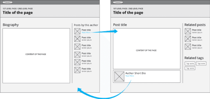
- Navigation built at a page content levelAt a content level, you can help the user navigate to all the links that are related to the content but that do not necessary respond to the site’s hierarchy structure. Recircula tion techniques are used to engage the user through similar or relevant content at the same time allowing section-wide navigation.Personalizing content for your viewers can take on many different forms: editor’s picks, most read, most popular, featured, etc. Using different personalization methods can greatly benefit the target’s audience reception of your website because it keeps their interest peaking. Try different approaches and decide which form of personalized content servers your site and content best.
 Source: ?
Using recirculation, you can also show a list of latest posts on a biography page of the author. You can also modify it so that after opening an article a list of articles that talk about the same topic appears; plus, you can add a list of tags that define the type of content of the article and related articles.
Case Study
www.landesa.org
http://www.landesa.org/what-we-do/india/odisha/
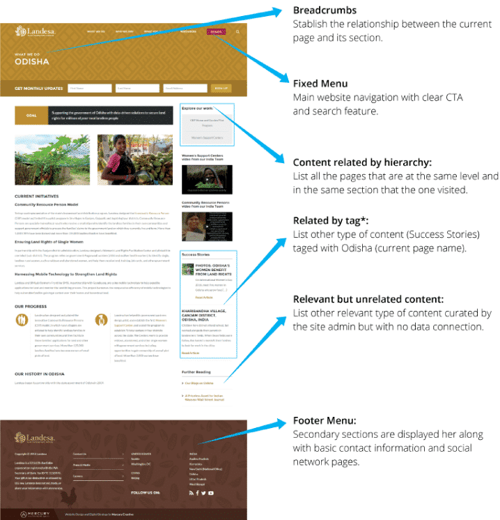 Source: Landesa.org
Well-structured navigation is essential to provide your viewers with the best browsing experience possible. When users have easy access to the content they want, they won’t click away to find it on your competition’s website. By applying all or only some of the methods mentioned above, you can expect better engagement with your website and higher conversion rates.
 Source: