
There are many paths a prospect can walk when visiting a website or e-commerce store. Asides from taking the ideal route from product page to checkout, there are a number of psychological processes that goes through a prospect’s mind while browsing.
A business can be offering the world’s best product or service, but if its online store has too many friction points, the prospects will fail to convert.
In an ideal scenario, a potential consumer goes directly from a product page to check out. But in reality, there are many paths prospects can take when visiting a website or e-commerce store. What they choose to do is highly influenced by a number of psychological processes that go through their mind while browsing. Therefore, the moment the negative user experience steps into the picture, a potential customer is quick to click away to the competition. That’s why to make sure your prospects become buyers, avoid the most common friction points websites contain.
1 Unexpected costs added
According to Statista, the number one reason shoppers leave an online website without making a purchase is that they were presented with an unexpected cost:
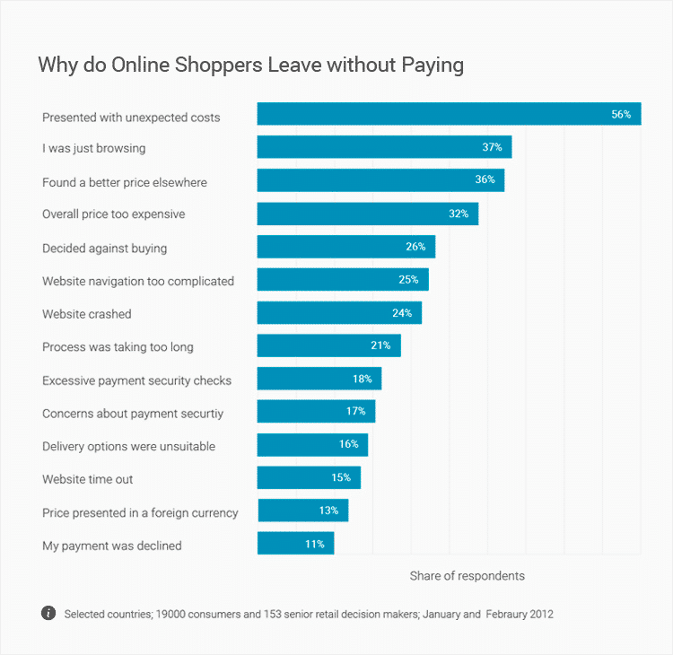
Source: Statista
The most common unexpected costs are:
- Added delivery costs
- Card processing fees
While free shipping may not be a viable option, there is a psychological trick businesses can implement instead. By conditioning shoppers to expect further costs upon checkout, businesses are reducing the shock the shoppers would otherwise experience if the shipping costs were hidden from the very start. Hiding fees until checkout often makes shoppers feel tricked and might spur them to quit the page.
Target, for example, has placed a small banner on each web page that reads: “Free shipping on orders of $25+ & free returns on everything”:
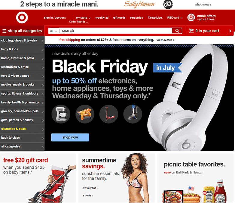
Source: Target
Shoppers are immediately aware there will be a shipping fee on all orders that don’t reach the minimum spend. When everything is clearly stated from the beginning, consumers are more likely to finalize their purchase.
2 Asking customers to sign-in
Before shoppers have a chance to pay for their products, many online stores will ask them to sign-in or create an account. But customers value their privacy, and they often don’t want to hand over their details for fear of receiving irritating calls and promotional emails.
The solution? Offer a guest checkout where shoppers don’t need to provide all of their personal data:
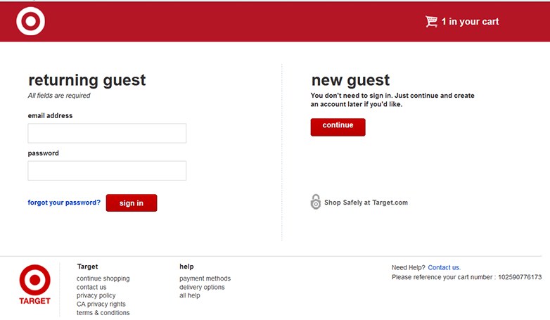
Source: Target
Guest checkouts streamline the buying process and increase the likelihood of conversion. Provide an option that allows the customer to create an account after they’ve made their purchase, not before.
3 Show the checkout steps
Each online store has its own checkout steps: some offer a single page while others require additional details and security checks. The Statista chart revealed that 21% of shoppers leave because the payment process was too long, and 18% exit because of excessive security checks.
Sometimes there’s no way around omitting security checks and multiple checkout steps during a purchase. So how to reduce friction?
Show shoppers each step of the checkout process:
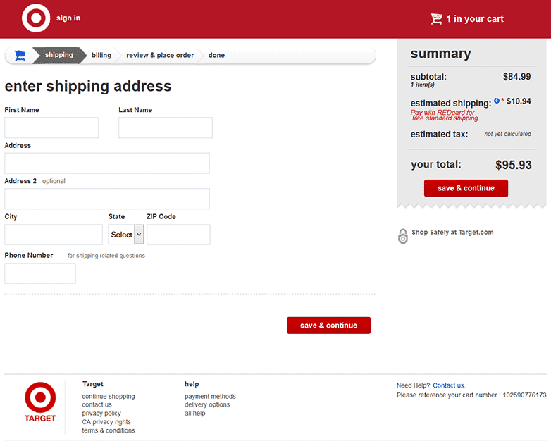
Source: Target
Target has a checkout banner that shows prospects they must enter their shipping details and billing data, and review the order before the transaction is complete. When shoppers are aware of what’s ahead, they are less likely to abandon their cart.
Less confusion and doubt = more sales.
4 Not having a clear search bar
Econsultancy estimated that 30% of all e-commerce shoppers use a website’s internal search bar, with shoppers who use the search bar having a greater intent to buy. Screen Pages graphed the results of 21 clients who all use a search bar on their website.
They found that in almost every case, shoppers who used the search bar generated greater revenue than those who didn’t:
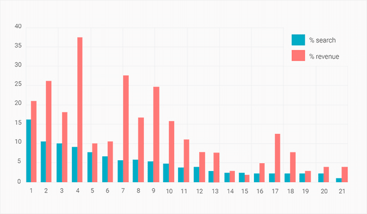
Source: Econsultancy
Think of a search bar like a call-to-action button on a landing page – it needs to be clear and easily spotted.
Amazon placed the search bar at the top of its homepage. White against a dark background, it can be spotted instantly:
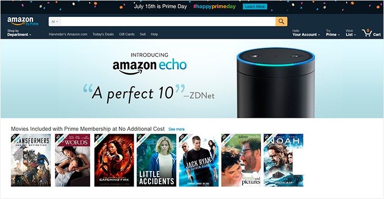
Source: Amazon
A great search bar is clearly visible and is optimized to return relevant items when used.
5 Lack of branding and social proofing
With so many websites selling similar products and services, branding plays a detrimental factor in consumer psychology. Ensuring your brand is visible and liked in the digital world increases your chances of sale.
Consumers are happy to pay a little extra and buy from a widely recognized brand they trust than from a website they’ve never heard of. Also, with 3 out of 4 customers visiting social media before making a purchase, having an active social media presence that prospects can interact with will reduce any friction.
Allowing customers to leave reviews for each product, too, helps with social proofing. Search Engine Land found that 88% of consumers trust an online review just as much as a recommendation from a friend.
Barnes & Noble allows customers to leave reviews on all products and aggregates the overall review score:
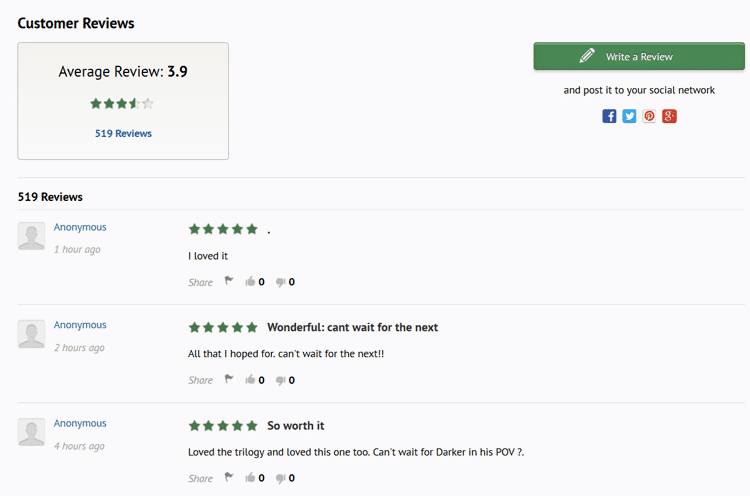
Source: Barnes & Noble
Online reviews and a good branding strategy are extremely important for businesses which lack a distinguished online presence.
6 Slow and poorly designed websites
25% of shoppers leave a web page because its layout is too confusing and another 21% leave because the website takes too long to load. So make sure your site doesn’t fall anywhere near these categories. Pingdom is a free tool that measures the load time of websites and gives tips on how to improve load speeds.
Remember, more is not always better. The more images, more code and products listed on a single page, the longer it takes a site to load.
All great e-commerce stores tend to follow these design rules:
- Optimized and visible search bar
- Plenty of white space
- Dropdown menu bar, right sidebar, and left sidebar
- A maximum of 3 clicks to reach any product page
Here a good example is the Sony Store. The store’s page uses a header menu, ample white space, a menu bar, and buttons to redirect different type of consumers: regular customers, students, and business customers to the right part of their website immediately:
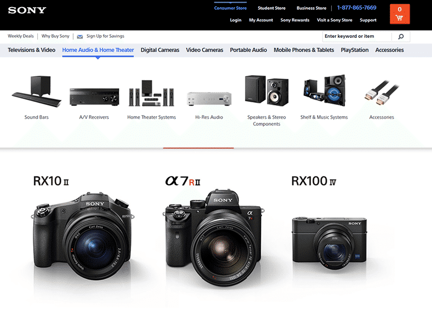
Source: Sony
Standing out from the competition is a primary motivation for businesses, but when it comes to website design, shoppers feel more comfortable on sites they know how to navigate. A great website experience keeps consumers engaged, shopping longer, which increases the likelihood of a sale.
Summary
There are several roadblocks between a prospect landing on a website to placing an order. With so many factors and psychological issues that affect online sales, one mistake might kill your online sales funnel.
However, addressing major friction points such as unexpected costs, website design, and checkout optimization, just to name a few, can increase sales drastically.
