As more competition joins the marketplace, it becomes difficult for consumers to differentiate one business from the other. The only thing that can save a company from getting lost in the sea of competition is careful branding.
Apple, Nike, Starbucks, McDonald’s, are all examples of businesses that owe their success to targeted branding – and all are iconic brands recognized worldwide.
By implementing a few marketing techniques used by those giants, brands can significantly increase their own growth.
Defining a brand
Branding a business should start with a careful analysis of the company’s culture, target customers, and desired values.
It’s not uncommon for two brands to compete in the same marketplace, yet have completely opposite brand values. For example, take a look at the Twitter accounts for both the Dollar Shave Club and Phillips. While both companies sell grooming products, they use completely different approaches to address their followers.

Anatomy of a successful logo
A logo is the face of a company. It’s the first thing the consumers identify a brand with. When people see a huge yellow M near the roadside or a small tick on a clothing garment, they instantly connect the logo with its respective brand.
Because of how deeply they are embedded in people’s minds, and how quickly they evoke associations with particular brands, logos play one of the biggest roles in marketing. So what should a successful logo include?
1 Functionality
Your company’s logo will represent your business everywhere, online and offline. It needs to look impressive on reports, merchandise, adverts, against light and dark backgrounds, on huge billboards, brochures, or postcard-sized documents.
The Adidas logo is a perfect example of a highly functional logo across implementations.
![]()
If a logo can be transferred onto any material, be expanded or reduced in size, and still be clearly recognized, it’s well-crafted.
2 Choosing the brand’s color
A logo is the spokesman of a business and should be in line with the brand’s image and the products or services it provides.
Companies like IBM and HP take advantage of the psychology of color. Both companies use similar variations of blue, a color that is associated with trust and security – traits that are expected of IT professionals.

Companies do this because they are well aware how colors can affect target audience’s attitude towards the brand.
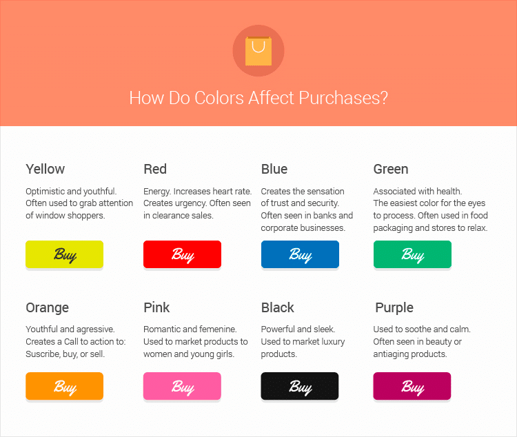
KISSMetrics created a useful infographic, explaining how and which colors influence purchase.:
One of the most commonly recognized logo transformations is that of Apple’s. In 2007, the company dropped the colorful version of its logo, and switched to a monochromatic equivalent of the famous fruit. By then Apple wasn’t just selling computer equipment, it began selling inspiring technology of the highest quality, and the company wanted its logo to reflect that. Moreover, from then on, all of Apple’s marketing materials became predominantly white – a color that represents perfection.
3 Uniqueness
What makes a logo desirable and catchy is its uniqueness. Copying logos or drawing too much inspiration from other, already established logos is not only asking for legal trouble but can also cause your company to be viewed as an imitator. And consumers don’t trust imitations – they crave an original.
So uniqueness but also timelessness. Neither Pepsi nor Coca-Cola will ever win the battle of being the tastiest, but Coca-Cola is indubitably the more recognizable brand. The reason is simple: whereas Coca-Cola’s logo has undergone only a few minor changes over the years – the swirly font almost always being the part of the logo – Pepsi’s logo, on the other hand, has been modified extensively.
4 The Looks
Aside from uniqueness and timelessness, simplicity is another quality of a good logo. Simple shapes and designs are easily memorized by the consumers. The most prominent example here is, of course, Apple’s apple with a bite mark.
The right color scheme and form are the foundations of a good logo. A talented graphic designer will help your company come up with the perfect logo for your brand.
Branding a company website
Since more than half of all Internet users begin their shopping online, a well-designed company website is invaluable. Using wrong colors, words, or layout on a brand’s web page can greatly decrease sales and stunt the company’s growth. To ensure that your company’s website appeals to your customers, follow these three simple steps.
1 A strong slogan
Every company needs a catchy and clever slogan that consumers associate with the brand’s qualities and products. That slogan has to be the first thing, right after a company’s logo, that potential customers see when they land on a business’s website.
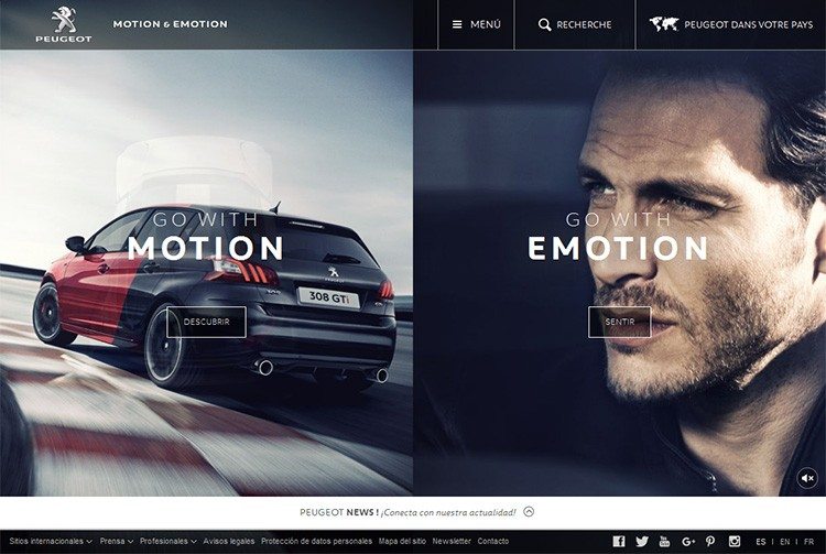
Car manufacturer Peugeot adopted the slogan Motion & Emotion, which is consistently repeated on their website. The company’s motto is designed to underscore the dynamic nature of the brand’s cars.
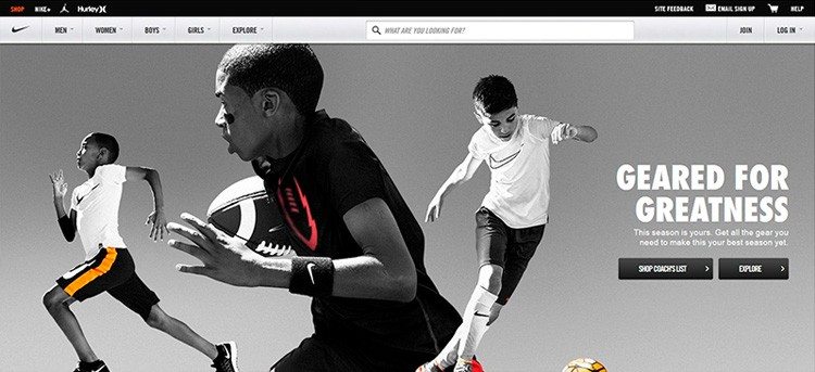
Nike, on the other hand, leveraged its Find Your Greatness mantra across all of its platforms to encourage consumers to stay active – and, of course, wear Nike’s clothes while doing that.:

Branding success relies heavily on keeping the message consistent over all platforms. Businesses should position their brand statement clearly on their website.
2 Color scheme
Too many colors on a website can be overwhelming. Therefore, a good website should have no more than three colors and their slight variations. All great brands rely on a limited set of colors that ultimately act as the brand’s uniform.
The colors on your company’s website should be in line with your company’s overall graphic design. Consumers feel safe and comfortable when surrounded with familiar colors, and they are more inclined to make a purchase.
3 User-Friendly
Above everything else, however, a website must be easy to navigate and use. Websites that don’t provide users with a good experience will scare them away long before they have a chance to see what the brand has to offer. Also, 48% of consumers think that websites with poor design are an indication that a brand cares little about its client’s buying experience.
Summary
Currently everything matters to the eye of a consumer, and every aspect of a brand needs to be tailored specifically for the needs of that potential client. Long gone are the times when simply having a fantastic product or service guaranteed success. Today, to get ahead of the competition, companies need to use a plethora of marketing strategies and meticulous branding to propel their business forward and increase sales.
